
ChatGPT Prompts for Sticker Design That Actually Sell

I've tested a lot of ChatGPT prompts for sticker designs. Some produced genuinely sellable results. Most produced the same flat, muddy, weirdly proportioned character that looked like it came from a royalty-free clip art CD circa 2009. If you've been running a print-on-demand shop on Etsy, or thinking about starting one, you already know what I mean.
The gap between a sticker prompt that sells and one that doesn't isn't about the AI. It's about how you're writing the instructions.
The Real Problem With Most AI Sticker Prompts
Most people describe what they want. That's the mistake. "A cute mushroom sticker with a smiley face" is a description. It tells the AI nothing about how it should look: the line weight, the surface style, whether it should feel like a vintage pin or a modern kawaii design. Without those details, ChatGPT fills in the gaps with its own defaults. And those defaults are average.
There's also a transparency issue. AI sticker output tends to look like AI sticker output: that slightly over-smooth shading, the vague sense that everything looks like everything else. Etsy is actively cracking down on unedited AI uploads now (yes, really), and buyers can tell when something feels like it came from a generator rather than a designer. So the prompt has to do more work than most people expect.
What a Working Sticker Prompt Actually Looks Like
Here's a prompt structure I've found actually works:
[Subject] + [style reference] + [illustration type] + [color palette] + [background note] + [finish or mood]
So instead of "cute mushroom sticker," try something like: "A kawaii mushroom character with a round body and tiny arms, flat vector illustration, bold 3px black outline, pastel coral and cream color palette, white background, sticker sheet style, clean and print-ready."
That prompt gives ChatGPT a visual target, not just a subject. The difference in output is immediate. Cleaner outlines. More intentional color. Something that actually looks like a sticker, not concept art for an animated film.
The "print-ready" instruction at the end is one I almost always include now. It nudges the output toward sharper edges and cleaner fills, things that matter when you're actually going to physical print.
The Style Cues That Change Everything
Style references are where most sellers are leaving output quality on the table. Saying "kawaii" gives ChatGPT a direction. But "kawaii in the style of a Sanrio pin badge from the 1990s, thick outline, flat color, slightly retro" gives it a category. That second prompt produces results with actual personality.
Some style cues that consistently work for sticker design:
- Enamel pin style: thick black outlines, flat bold colors, very little gradient. Great for vintage and retro packs.
- Gouache illustration style: slightly textured, painterly but clean. Works well for botanical or food-themed stickers.
- Sticker doodle / hand-drawn style: imperfect line work, slightly wobbly fills. Makes the design feel human, which is exactly what Etsy buyers want right now.
- Flat vector icon style: clean, geometric, no outlines. Scales perfectly for both digital and physical print.
Sound familiar? You've probably seen all four of these styles in best-selling Etsy shops. They sell because they're specific. Generic prompts produce generic stickers. Specific prompts produce stickers with a point of view.
This is exactly why the sticker and illustration prompts at PromptPlaza.store were built around real design work. They weren't assembled as a content experiment. They were developed out of actual client projects and refined until the output was consistently usable.
When the AI Gives You Mush
It happens. You write a careful prompt and get back something that looks like a marshmallow dipped in watercolor. Here's how I troubleshoot it:
The outline is too thin or blurry. Add "bold black outline, 3-4px stroke weight" to the prompt. ChatGPT responds well to specific line weight directions.
The color palette is muddy. Specify hex codes or actual color names. "Sage green and dusty rose" beats "pastel" every time.
The character looks anatomically weird. Adding "symmetrical, centered composition, simple proportions" helps. But sometimes you just need to regenerate a few times. I've gone through 6 to 8 variations before landing on something worth keeping. This is normal. Don't stop at the first output.
The background isn't clean. Specify "white background, no shadows, no gradients in background." Then remove the background in Photoshop or Canva after. A 10-minute edit is the difference between a listing that lasts and one Etsy quietly removes.
Building a Sticker Pack, Not Just One Sticker
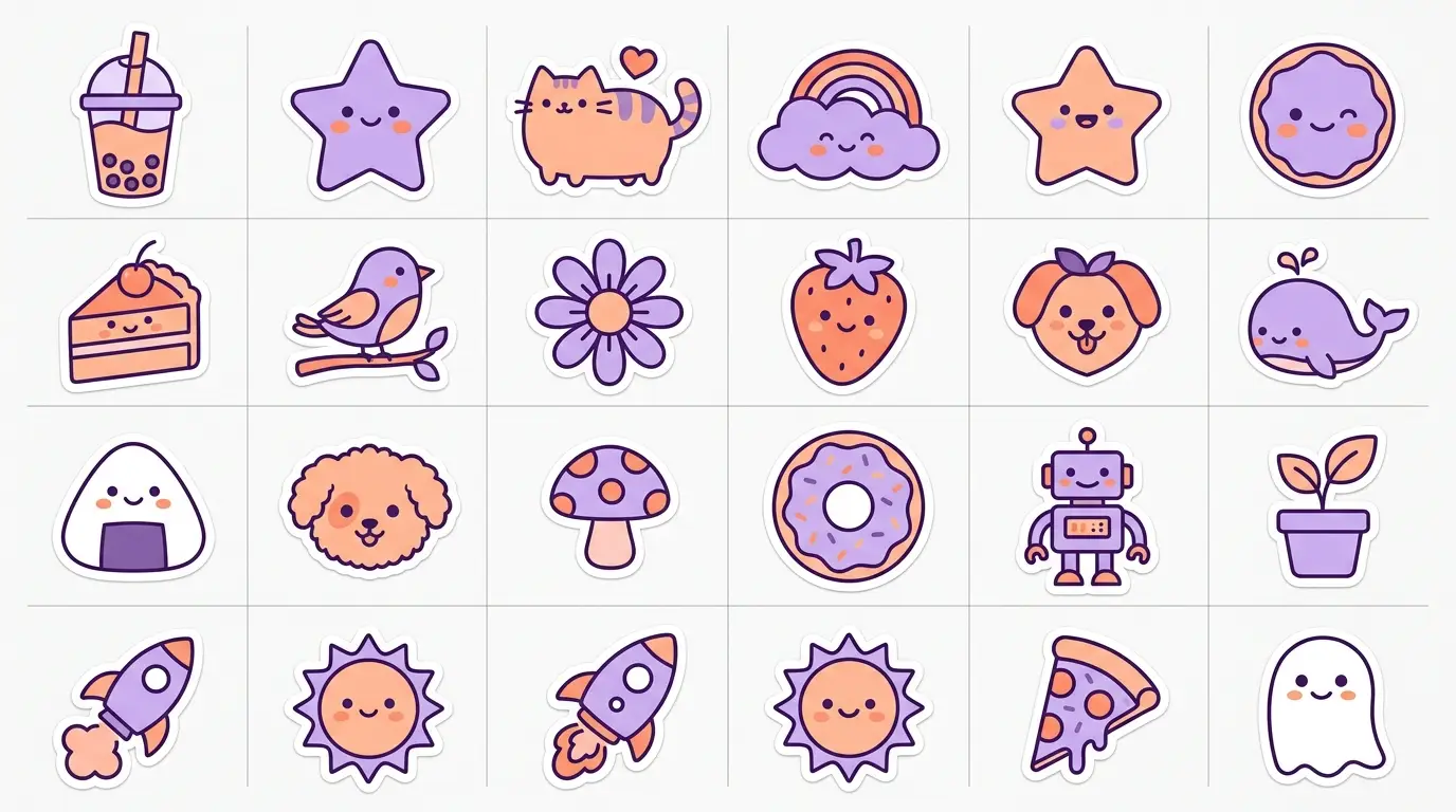
One sticker is a test. A pack is a product. And building a cohesive pack with ChatGPT requires one more layer of prompt discipline: consistency.
The trick is to define your style in detail once, then lock it across every subsequent prompt. I write out the full style description (line weight, palette, illustration type, finish) and append it to every prompt in the series. It adds a few extra seconds per generation. But the pack hangs together as a set instead of looking like 10 random images from different designers.
Honestly, this is where a tested, structured prompt template makes a real difference. Starting from scratch every time is slow and inconsistent. Starting from a prompt that's already been optimized for a specific sticker style means you're building a shop inventory instead of running experiments.
If you're ready to skip the trial and error, the sticker and illustration prompt packs at PromptPlaza.store are built exactly for this. Structured, specific, designed to produce consistent output across a full pack. Written by a working designer, tested on real design briefs.
The AI does the generating. You run the shop.


