
The Graphic Designer's Guide to Working Faster with ChatGPT Image Prompts

Okay, I'll be honest: I didn't expect much when the big text-rendering update landed. I've been using ChatGPT's image generator almost daily for client work, and by that point I'd already mentally filed it under "good for moodboards, useless for anything with type." Then I saw the text rendering on the new model and had to go back and re-test basically everything.
If you're a graphic designer who's been treating ChatGPT's image generator as a toy, this is worth 5 minutes of your time. Here's what changed and how I'm actually folding it into real work.
What Actually Changed — And What Matters for Designers
Three things hit different with the current model. Not the press-release version. Just the stuff that actually affects your day:
- Text rendering. This was the big one for me. For months, any prompt that needed readable type on it meant a detour through Illustrator to fix the output. Now labels, headers, and social post text come out at close to 99 percent character accuracy, clean enough to present as a concept. Not always perfect. But usable.
- Reasoning before rendering. The model now thinks through your prompt before generating. Complex briefs with 5+ specific requirements actually land. You know that thing where you specify a style and it ignores half of it? Happens a lot less now.
- Composition control. Multi-element layouts are more predictable. "Logo left, product right, dark background" mostly does that now. The chaos in complicated scenes is finally dialed back.
Is it replacing Figma or Illustrator? No. But it's earning a real spot in the concept phase.
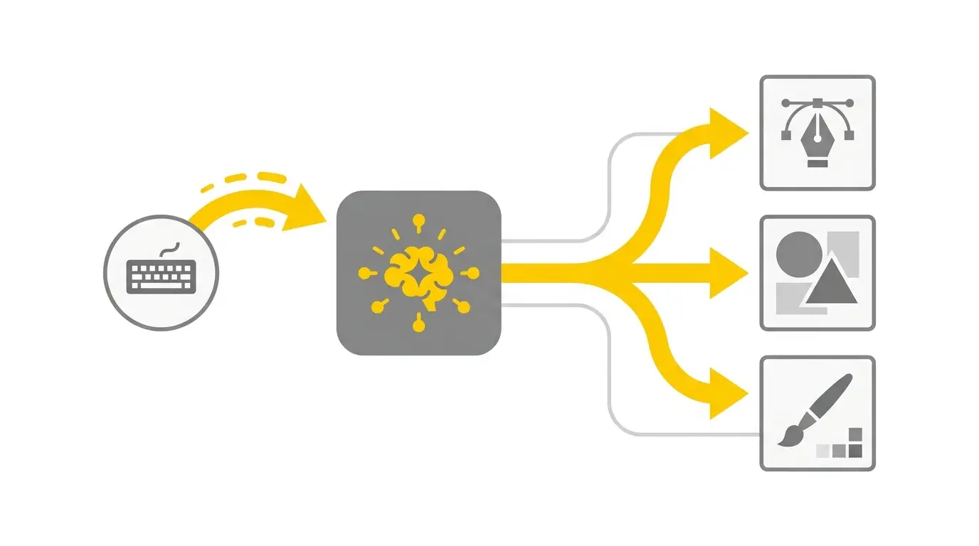
How I Actually Use It in My Workflow (Not Theory)
Here's what a real week looks like:
Start of a project: moodboarding. Client sends a brief, I spend 20 minutes generating visual directions in ChatGPT before I open a single design tool. Used to take me hours pulling references from Behance and Pinterest. Now I show up to the first call with actual visual concepts already on screen. Clients respond to it differently. They feel like work has started.
Mid-project: exploring directions. When a client says "can we go more modern?" instead of rebuilding, I prompt that direction and spin up 4 variations in 2 minutes. Pick the strongest, refine in Illustrator. The back-and-forth that used to take a revision cycle takes 10 minutes now.
Smaller briefs: near-final drafts. For social posts, icon sets, or sticker packs, sometimes the output is 80% of the way there. I clean it up, vectorize if needed, and I'm done. That's time I'm billing for something else.
The mindset shift that made everything click: treat it like a very capable intern who needs specific direction, not a magic button you press and hope for the best.
Your Prompt Is Doing More Work Than You Think
This is where most designers leave results on the table. And honestly, the way people are taught to use these tools doesn't help.
Vague prompt: "Make a logo for a coffee shop." You'll get something forgettable. Every time.
Better: "Minimalist badge logo, artisan coffee shop, warm amber and cream palette, hand-drawn feel, no text, circular format, white background." Now you're giving a brief. That's the actual difference.
This is exactly why starting from a tested prompt template beats starting from scratch every single time. At PromptPlaza.store, every template was built out of real client projects. They're structured to get actual results from ChatGPT's image generator, whether you need a logo, a flyer, a mockup, or a sticker pack.
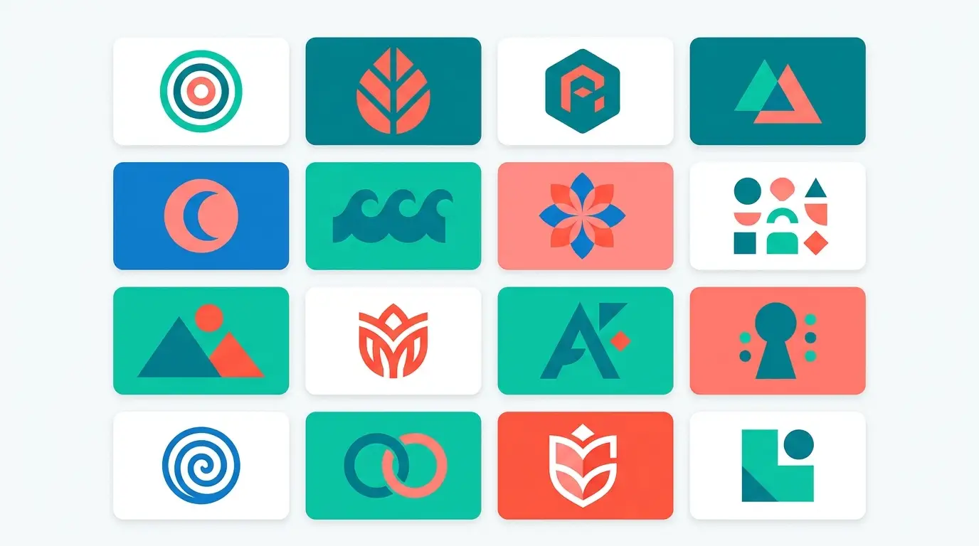
Mistakes That'll Cost You Time
Four things I had to learn the slow way:
- Stacking too many style references. "Minimalist modern vintage retro clean bold" means pick one direction. Conflicting descriptors confuse the output and you end up with nothing that works.
- Stopping at the first result. Always generate 4. The first one is rarely the best one, and you're spending fractions of a cent per image.
- Forgetting what you don't want. "No text," "no watermark," "not photorealistic" — these exclusions change the result more than most people realize.
- Not using plain-language follow-ups. You can literally say "make the colors warmer" or "shift the composition to center." It understands you. Most people just regenerate from scratch instead of refining. That's slower.
Stop Wasting Time on Prompts That Don't Work
Learning to write great prompts from zero takes longer than it should. And when you're on a deadline or billing by the project, trial and error isn't a great use of your time.
The shortcut is starting from prompts that are already built and tested. PromptPlaza.store covers every major design category: logos, flyers, posters, mockups, illustrations, icons, stickers. All built by a working graphic designer from real projects. Under $5 each. Paste it in, adjust one or two details for your brief, and you're generating with intention instead of guessing.
Go check it out. Your next concept is faster than you think.


